2022-06-18 11:30:18 来源:中国教育在线
2022年4月23日雅思柱状图范文
WRITING TASK 1
You should spend about 20 minutes on this task.
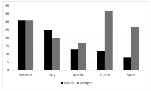
The chart below shows the consumption of apples and oranges per person in kilograms in five countries in 2013.
Summarise the information by selecting and reporting the main features, and make comparisons where relevant.
Write at least 150 words.

注:图形根据考场回忆绘制,具体细节或有出入。
【图形分类】
静态柱状图
【题目解析】
题目大意:柱状图描写了欧洲五个国家2013年每人消耗苹果和橘子的量。
总的来说,Austria,Turkey和Spain每人消耗橘子的量大于苹果的量,而在Italy,情况相反;Denmark两种水果的量相同。
这个题目是静态图,故需要考生进行比较,而不是写“趋势”。
根据题目信息,可以将图表分为“苹果”和“橘子”两组,针对五个国家进行比较。
【写作思路】
Para 1 = 题目改写 + 概述
Para 2 = 描写苹果的数据
Para 3 = 描写橘子的数据
【参考范文】
The bar chart illustrates how many apples and oranges each individual in five nations in Europe consumed in 2013. Overall, while the consumption of oranges per person was higher than that of apples in Austria, Turkey, and Spain, every Italian loved apples more than oranges; meanwhile, people in Denmark had the same preference for the two fruits.
Regarding apples, the consumption per capita in Denmark was by far the largest, at slightly over 30 kilograms whereas the quantity in Spain was the least, at about 7 kilograms. In Italy, everyone ate 25 kilograms, and this figure was nearly twice higher than that in Austria and Turkey, at roughly 13 kilograms and 12 kilograms respectively.
Turning to oranges, Turkish people ate considerably more than those in any other country, at 37 kilograms. Residents in Denmark consumed approximately 31 kilograms, followed by some 37 kilograms in Spain, 20 kilograms in Italy, and around 17 kilograms in Austria.
(155 words)


(一)由于考试政策等各方面情况的不断调整与变化,本网站所提供的考试信息仅供参考,请以权威部门公布的正式信息为准。
(二)本网站在文章内容来源出处标注为其他平台的稿件均为转载稿,免费转载出于非商业性学习目的,版权归原作者所有。如您对内容、版 权等问题存在异议请与本站联系,我们会及时进行处理解决。"